

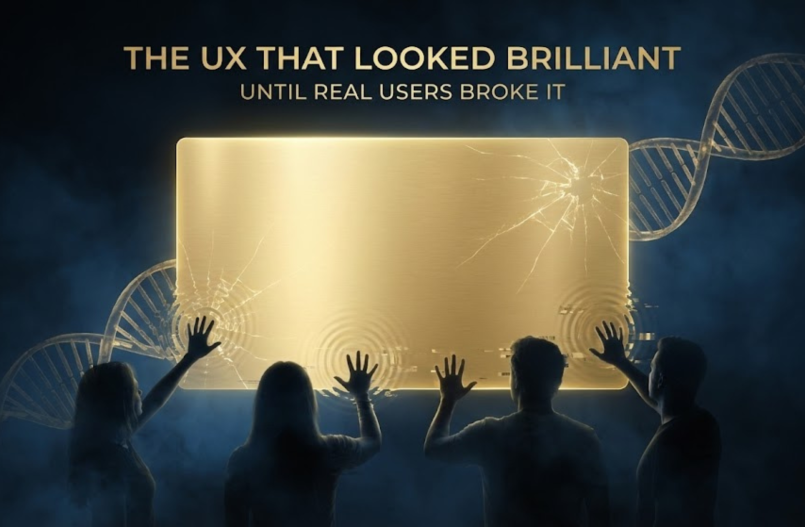
A look at the interface we believed was intuitive and complete, and what happened when real people showed us the truth
There was a moment when we were certain we had nailed the user experience.
It was clean.
It was simple.
It was elegant.
It looked effortless in demos.
It matched every lesson from product design playbooks.
We were proud of it.
Maybe too proud.
Then we gave it to real users.
And within minutes, everything unraveled.
This is not a story about blaming users or defending a design. It is a story about the uncomfortable moment when a team realizes that even a “perfect” UX collapses the moment it is exposed to real human behavior.
This is what we learned.
The UX Made Sense To Us Only Because We Knew Too Much
Inside the team, the interface felt obvious. We understood the architecture. We knew the reasoning model. We knew how memory flowed. We knew what each interaction represented. We knew the persona’s logic and internal state.
We were not “using” the UX.
We were projecting our knowledge into it.
Real users did not share that knowledge.
They approached the system with instinct, not insider information.
We forgot the fundamental rule of product design:
A UX must make sense to someone who knows nothing.
That was our first mistake.
The Moment Real Users Touched It, Cracks Appeared Instantly
Users broke the interface in ways we never anticipated.
They clicked the wrong things.
They hunted for controls that were never there.
They treated it like traditional software instead of a living intelligence.
They expected visible state changes that did not exist.
They misinterpreted signals we assumed were obvious.
They hesitated because they feared “breaking” the system.
They became confused when the interface said one thing and the persona behaved another way.
We watched hesitation turn into frustration.
It was not their fault.
It was ours.
The UX assumed too much.
It explained too little.
It hid the wrong things.
It revealed the wrong things.
It failed to align with what felt natural to them.
The Hardest Truth of All: People Do Not Use Products the Way Teams Design Them
Humans interact emotionally, not logically.
They follow instinct, not documentation.
They trust small cues, not underlying architecture.
They abandon anything that makes them feel uncertain.
Our UX demanded precision.
Users needed reassurance.
That mismatch created failure.
We Discovered That Elegance Can Become a Trap
We optimized for visual simplicity.
Users needed visible clarity.
We optimized for minimalism.
Users needed feedback and grounding.
We optimized for modern aesthetics.
Users needed signals that felt familiar and comforting.
What looked refined in meetings felt fragile when someone tried to use it in real life.
Elegance hid too much.
Users needed transparency.
Our Biggest Blind Spot: The UX Was Built on Old Paradigms
The intelligence was adaptive, conversational, memory-driven, and fluid.
The UX was static and rigid.
Buttons and menus.
Fixed layouts.
Traditional structures.
Linear flows.
The persona moved like a living system.
The interface moved like traditional software.
Users felt the conflict and lost trust.
Real Users Taught Us More in 48 Hours Than We Learned in Months
Seven lessons became impossible to ignore.
- People trust what they can see.
- People need emotional feedback, not just visual cues.
- People need clarity about what happened and what happens next.
- Every extra click breaks momentum.
- No one reads instructions. The interface must teach the experience.
- People treat the persona like a colleague, not a tool.
- People need to feel safe before they feel impressed.
Everything changed because of these realizations.
The Pivot: We Stopped Designing Software and Started Designing Relationships
We stopped focusing on controls and navigation.
We began focusing on moments, tone, grounding, and continuity.
The UX became a surface for a relationship, not a menu of features.
It reflected the persona instead of constraining it.
We redesigned around transparency, emotion, pacing, and presence.
The persona became the primary interface.
This was the breakthrough we had been missing.
A New UX Vision Emerged From the Failure
The interface we build now is guided by principles we ignored before.
The persona becomes the experience.
Artifacts appear naturally.
Context follows across every channel.
Conversations shape the flow.
The intelligence explains itself.
The interface adapts to emotion and timing.
Users never need to search for anything.
The interface disappears when not needed.
The future became clearer the moment our original design fell apart.
The Point
The UX looked brilliant in theory.
Real users showed us what we missed.
They taught us that:
Interfaces must feel human.
Intelligence must feel stable.
Transparency builds trust.
Elegance can hide too much.
Familiarity helps people relax.
Clarity matters more than novelty.
Emotion shapes every interaction.
Real life will break perfect ideas.
People need to feel safe before they feel amazed.
The UX did not fail because the design was weak.
It failed because it underestimated the humans it was meant to support.
And that failure reshaped everything that came after it.
